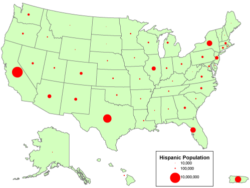
 A Proportional Circle map is a very easy map to read and understand. They use circles to represent a value, with the larger the circle being equal or proportional to a larger population. Basically, bigger circle, bigger value. As in this map, which is a map of the US showing the Hispanic population in each state. Each state population is represented with a circle, the larger the circle the larger the population in state.
https://courseware.e-education.psu.edu/courses/geog482/graphics/hisp_circles.gif
No comments:
Post a Comment