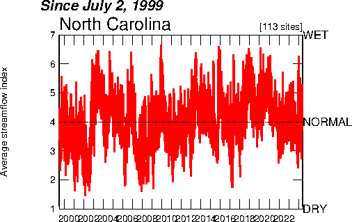
The index value plot can help to track data over a series of time. This plot shows the average streamflow in North Carolina, and keeps track of whether it was wetter and drier in relation to the historical data.
http://images.google.com/imgres?imgurl=http://waterwatch.usgs.gov/regplots/real/real_nc_2.gif&imgrefurl=http://water.usgs.gov/waterwatch/%3Fm%3Dreal%26r%3Dnc%26w%3Dreal%252Cplot&usg=__vkTvnbBvoJv--Wb2BHENjNSJMNU=&h=450&w=550&sz=10&hl=en&start=17&um=1&tbnid=1sBUYWU8PsTYWM:&tbnh=109&tbnw=133&prev=/images%3Fq%3Dindex%2Bvalue%2Bplot%26hl%3Den%26client%3Dsafari%26rls%3Den-us%26sa%3DN%26um%3D1
No comments:
Post a Comment