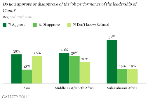
http://media.gallup.com/poll/graphs/080429China2Graph2_GASJIDHUQfredo.gif
Sunday, August 9, 2009
Bilateral Graph
Bivariate Choropleth Map
A bivariate choropleth map is a choropleth map that displays more than one variable at a time, with different amounts of shading or with other different map layers. These maps can convey large amounts of information, such as this one about land use, per capita spending, and life expectancy in Africa.
Lorenz curve
http://www.google.com/imgres?imgurl=http://content.answers.com/main/content/img/oxford/Oxford_Geography/0198606737.lorenz-curve.1.jpg&imgrefurl=http://www.answers.com/topic/lorenz-curve&h=436&w=431&sz=27&tbnid=hwE39wO2MLKC8M:&tbnh=126&tbnw=125&prev=/images%3Fq%3Dlorenz%2Bcurve&usg=__Su0dmMx-rqkSoU1ikmc5-S75Dts=&ei=jmZ_SuiYNseOtgf35-zgAQ&sa=X&oi=image_result&resnum=4&ct=image
Univariate Choropleth Map
Nominal Area Choropleth
Nominal area choropleth are maps with data that cannot be ordered any particular way or be shown any particular way except with colors. A great example would be this map, a map of the states and their electoral votes and who won the state. The data can be easily displayed in this format.
http://politicalmaps.org/wp-content/uploads/2007/12/2008-prediction-map-11252007.jpg
Index value plot
The index value plot can help to track data over a series of time. This plot shows the average streamflow in North Carolina, and keeps track of whether it was wetter and drier in relation to the historical data.
http://images.google.com/imgres?imgurl=http://waterwatch.usgs.gov/regplots/real/real_nc_2.gif&imgrefurl=http://water.usgs.gov/waterwatch/%3Fm%3Dreal%26r%3Dnc%26w%3Dreal%252Cplot&usg=__vkTvnbBvoJv--Wb2BHENjNSJMNU=&h=450&w=550&sz=10&hl=en&start=17&um=1&tbnid=1sBUYWU8PsTYWM:&tbnh=109&tbnw=133&prev=/images%3Fq%3Dindex%2Bvalue%2Bplot%26hl%3Den%26client%3Dsafari%26rls%3Den-us%26sa%3DN%26um%3D1
Unclassed Choropleth Map
Scatterplot
http://images.google.com/imgres?imgurl=http://argyll.epsb.ca/jreed/math9/strand4/scatterplot1.gif&imgrefurl=http://argyll.epsb.ca/jreed/math9/strand4/4103.htm&usg=__Vkq_omWHAUwEnSSIjpV8UrLeh84=&h=342&w=386&sz=3&hl=en&start=3&um=1&tbnid=qGA02ra6hj-tPM:&tbnh=109&tbnw=123&prev=/images%3Fq%3Dscatterplot%26hl%3Den%26client%3Dsafari%26rls%3Den-us%26sa%3DN%26um%3D1
Range Graded Proportional Circle Graph
This is also a graph where the circles are directly proportional to the variable being portrayed from that distinct area. The difference in the range graded is that there is only one variable being represented unlike the continuously variable circle maps. It is helps in the ease of reading. This is a map of Mexican population in the West.
Population profile
http://images.google.com/imgres?imgurl=http://www.ifad.org/operations/regional/pf/figure1.gif&imgrefurl=http://www.ifad.org/operations/regional/pf/aids_1.htm&usg=__T9NIj9Ua-EqX2y0qr_tpYFzeptM=&h=365&w=533&sz=7&hl=en&start=2&um=1&tbnid=1A_xvum0F1zaWM:&tbnh=90&tbnw=132&prev=/images%3Fq%3Dpopulation%2Bprofile%26hl%3Den%26client%3Dsafari%26rls%3Den-us%26sa%3DN%26um%3D1
Continuously variable proportional circle map
These maps are proportional circle maps, with another variable inside the circle in the form of a pie chart. The circles not only represent a number directly proportional to the size and another percentage variable also. This continuously variable prop circle map is from Czech Republic.
http://geographyfieldwork.com/Choropleth2.gif
Climograph
http://www.google.com/imgres?imgurl=http://wps.prenhall.com/wps/media/objects/214/219557/climograph2_national_drought%2520_mitigation_center.gif&imgrefurl=http://wps.prenhall.com/esm_tarbuck_escience_10/3/857/219574.cw/index.html&h=246&w=350&sz=19&tbnid=iH_EVhmV6By8oM:&tbnh=84&tbnw=120&prev=/images%3Fq%3Dclimograph&usg=__4iKQqk3qqN4SglceKQOtuCs3W3g=&ei=yl5_SpqiIOjBtweBhbXzAQ&sa=X&oi=image_result&resnum=6&ct=image
Standardized Choropleth Maps
A standardized map uses information that is uniform and can easily be displayed across a wide area. The data is areally averaged and usually shown with a color code as in this map. This map shows the amount of the Canadian population that is under 14.
http://www.statcan.gc.ca/pub/92f0138m/2008003/figures/figure3.1-en.jpg
Windrose
The wind rose is a tool that is used predominantly by meteorologists. It is used to determine the wind speed and direction of the surrounding areas as it could affect flight and weather conditions. The further out from the center that the colors extend, the more intense the data is.
http://images.google.com/imgres?imgurl=http://www.crh.noaa.gov/images/sgf/climate/windrose/windrose_sgf_jan.png&imgrefurl=http://www.crh.noaa.gov/sgf/%3Fn%3Daviation_forecasts&usg=__SelXVMMUjKNMWFe8gxiP8SNoEQ0=&h=473&w=402&sz=16&hl=en&start=10&um=1&tbnid=cJelK1CptHkwbM:&tbnh=129&tbnw=110&prev=/images%3Fq%3Dwindrose%26hl%3Den%26client%3Dsafari%26rls%3Den-us%26sa%3DN%26um%3D1
DOQQ
Triangle plot
http://www.dplot.com/triangle_plot.htm
DEM
DLG
Parallel coordinate graph
http://www.evl.uic.edu/aej/526/kyoung/Training-parallelcoordinate.html
Isopleth
Histogram
A histogram is a very similar graph style to that of a bar graph. The main difference is that histogram's represent data in terms of ranges where as bar graphs represent data in terms of specific value. Histograms record the frequency in which a result occurs within a certain range and compares that to the frequency of the other ranges.
Isopachs
http://images.google.com/imgres?imgurl=http://www.eduplace.com/math/mhm/5/06a/ts_5_6a_wi-1.gif&imgrefurl=http://www.eduplace.com/math/mhm/5/06a/index.html&usg=__2ehQfQBpEn5_Elz1d1fNoam2NCc=&h=267&w=235&sz=5&hl=en&start=3&um=1&tbnid=uSXivEv81o_H6M:&tbnh=113&tbnw=99&prev=/images%3Fq%3Dstem%2Band%2Bleaf%2Bplot%26hl%3Den%26client%3Dsafari%26rls%3Den-us%26sa%3DN%26um%3D1
DRG
http://www.tceq.state.tx.us/assets/public/gis/images/drg.gif
Isohyets
Similarity matrix
Isotachs
Isobars
LIDAR
http://www.math.ucdavis.edu/~widemann/research/Ground_Zero_Lidar.jpg
Correlation matrix
C1 C2 C3 C4 C5 C6 C7 C8 C9 C10 C1 1.000 C2 0.274 1.000 C3 -0.134 -0.269 1.000 C4 0.201 -0.153 0.075 1.000 C5 -0.129 -0.166 0.278 -0.011 1.000 C6 -0.095 0.280 -0.348 -0.378 -0.009 1.000 C7 0.171 -0.122 0.288 0.086 0.193 0.002 1.000 C8 0.219 0.242 -0.380 -0.227 -0.551 0.324 -0.082 1.000 C9 0.518 0.238 0.002 0.082 -0.015 0.304 0.347 -0.013 1.000 C10 0.299 0.568 0.165 -0.122 -0.106 -0.169 0.243 0.014 0.352 1.000
A correlation matrix is a way to record data for multiple different variables, and to see how all of those variables interact with each other. The matrix has all of the measured variables listed both down the left side of the graph and across the top. Then a statistics program is used to determine the correlation between all of the different variables in relation to each other.
http://www.socialresearchmethods.net/kb/statcorr.phhttp://www.socialresearchmethods.net/kb/statcorr.phhttp://www.socialresearchmethods.net/kb/statcorr.php
Doppler Radar
http://www.srh.noaa.gov/jetstream/doppler/images/fdr_baserefl.jpg
Black and White Aerial Photography
Infrared Aerial Photos
http://www.aerialarchives.com/imagedb/IR0010154f.jpg
Cartographic Animation
Star plots
http://www.math.yorku.ca/SCS/icons/sugi16/staraut2.gif
Saturday, August 8, 2009
Statistical Map
http://slabbed.files.wordpress.com/2008/04/totclaims2005sm.gif
Cartograms
http://electoral-vote.com/evp2007/Pres/Carto/Dec27-c.png
Thursday, August 6, 2009
Flow Maps
Isolines
Proportional Circle Map
A Proportional Circle map is a very easy map to read and understand. They use circles to represent a value, with the larger the circle being equal or proportional to a larger population. Basically, bigger circle, bigger value. As in this map, which is a map of the US showing the Hispanic population in each state. Each state population is represented with a circle, the larger the circle the larger the population in state.https://courseware.e-education.psu.edu/courses/geog482/graphics/hisp_circles.gif
Choropleth Maps
http://www.neighbourhood.statistics.gov.uk/HTMLDocs/images/BP%2520Maps6_tcm97-50746.jpe
Dot Distribution Maps
PROPAGANDA!
Hypsometric Map
PLSS Maps
FORGOT URL ON LAST TWO POSTS*
Thematic Maps
Planimetric Maps

Planimetric Maps are the basic component to simple maps and probably the most recognizable maps. They are flattened completely to show horizontal features but vertica features are basically ignored. This is a Planimetric map of Vancouver, Washington from1917-1949 peroid and it shows the Vancouver barracks, Vancouver municipal airport and Kaiser shipyards.
Subscribe to:
Comments (Atom)